A History of Mobile Design
Before we dive into some intricacies of mobile first design: who it works for, who it doesn’t work for, how to determine if it’s right for you, and an alternative – let’s first look at a brief history of the mobile phone being used for browsing the internet:
Clik here to view.

Clik here to view.

Clik here to view.

Clik here to view.

Clik here to view.

Mobile use exploded throughout the 2010’s.
This revolution led many web designers and developers to consider: “Because so many people are on mobile devices, perhaps we should design for them.”
Enter: Mobile First Design.
What Is Mobile First Web Design?
Let’s first speak to a typical web design process:
A website is typically, or perhaps formerly, designed assuming it will be viewed and interacted with most often on a desktop or laptop computer. Therefore, the initial design effort is put into the desktop version of the site. Once the desktop design was complete, the site was then designed for mobile – more often than not simply removing certain elements and delivering a more minimal product. This process is sometimes termed graceful degradation.
Mobile first design is exactly as it sounds: designing first for the experience on the smallest screen size and then working your way up. The emphasis is placed primarily on the mobile device.
This strategy has been called progressive advancement or progressive enhancement.
The idea of mobile first design is simple: “Everyone has a smartphone, let’s start designing for them.”
Having said that, the situation really isn’t that straightforward.
Designing for Your Audience
Let’s ask some better questions, not just around mobile ownership:
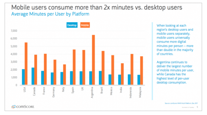
On what device do people spend the most time on the internet?
Answer: cell phones:
Clik here to view.
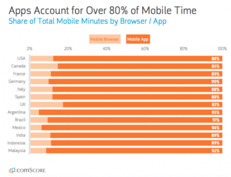
BUT – is all of that time spent browsing the internet on websites?
Answer: nope. We’re watching a lot of Netflix and looking for GIFs on apps:
Clik here to view.
Got it – lots of people spend time on their phones, but not always on websites.
So of all website visits, what percentage of traffic comes from mobile?
Clik here to view.
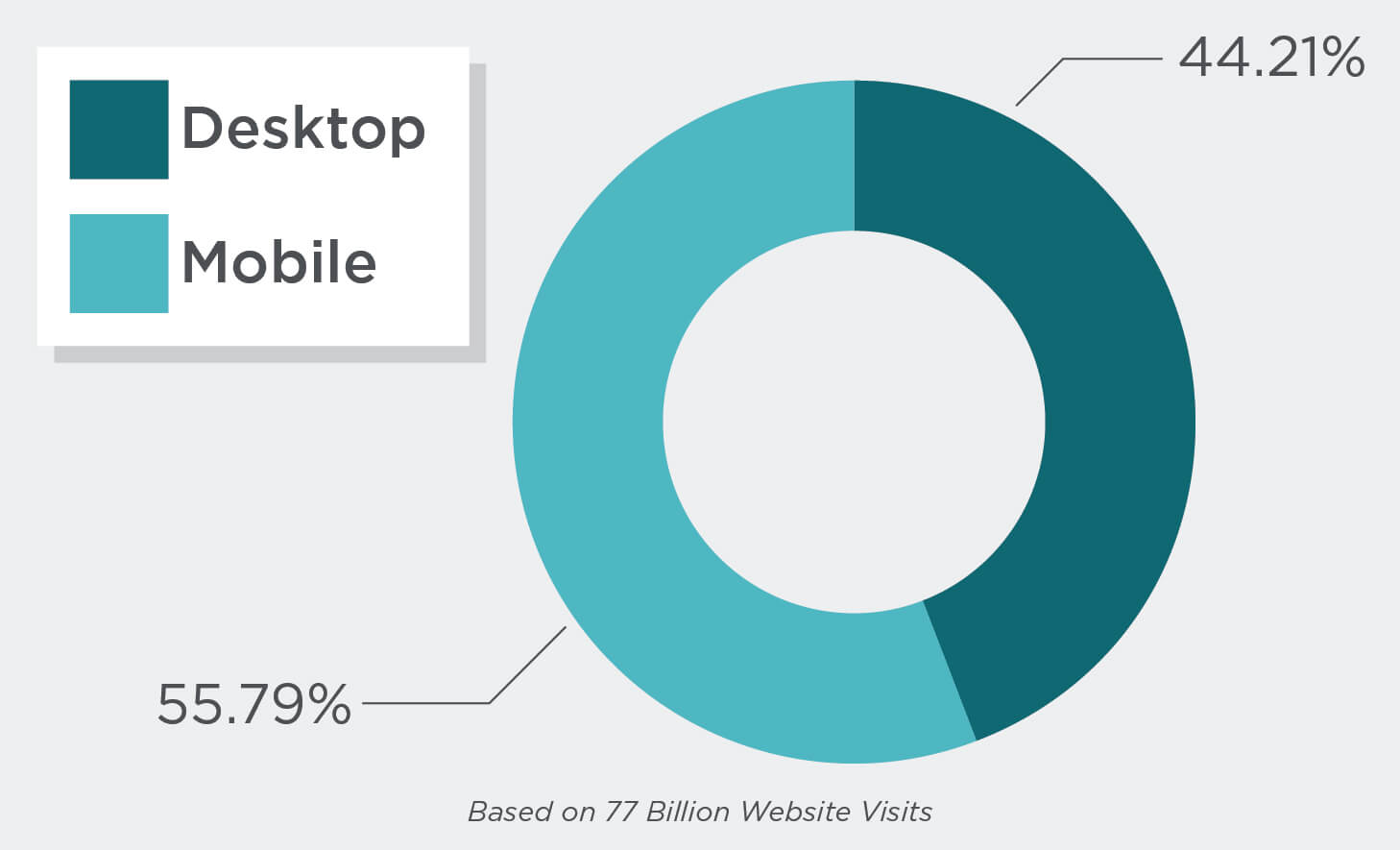
More overall website visits on mobile.
But, is that true in all industries?
Clik here to view.
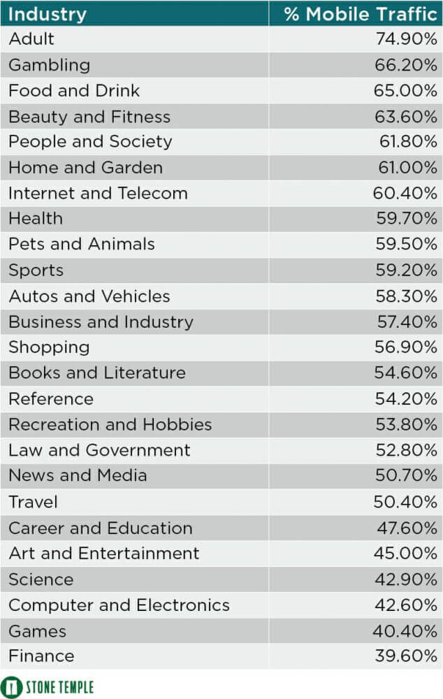
It’s true in most industries. So the majority of site visits in the majority of industries take place on mobile devices.
Next question: on average, how much time is spent per site visit on mobile devices compared to desktop?
Clik here to view.
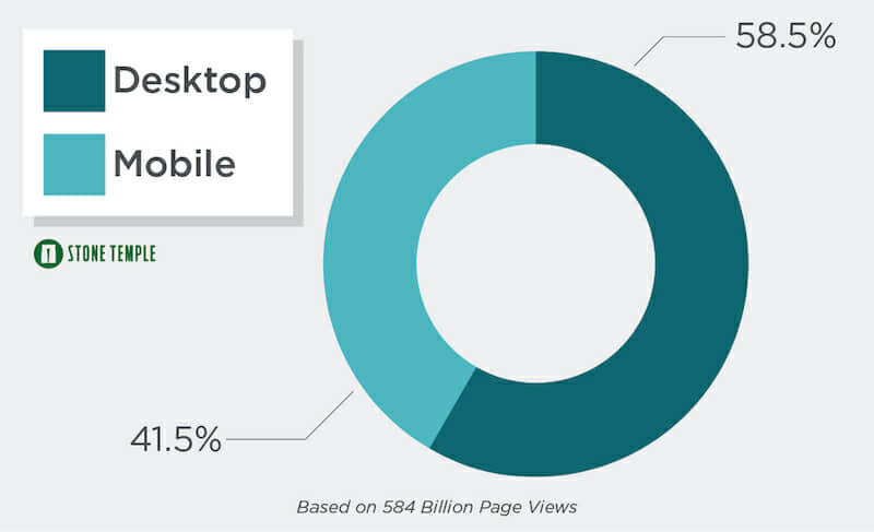
Overall, we see more time on site from desktops.
Again, is this true in all industries?
Clik here to view.

Only 1 industry boasts a higher average site visit from mobile devices.
Finally, on what device do people most often convert (i.e. sign up for a newsletter, make a purchase, request a quote, etc…)?
Clik here to view.

*The above data is from Smart Insights’ Mobile Marketing Statistics and Stone Temple’s Mobile vs Desktop Usage.
A few takeaways from all that data:
- Although more overall website visits come from mobile devices, more time is spent per site visit on desktops.
- The data looks a little different depending on industry.
- Americans are using multiple devices throughout their day, and throughout their buyer’s journey.
An example: Karen is looking for some shoes. She begins her preliminary research from the comfort of her home on a tablet. She starts with Google and reads a few articles and reviews. The next day, while at work (during a break of course), Karen uses her desktop to do some product browsing on a few different sites. She has narrowed her search to two brands. She does a little more browsing on her phone during her lunch break. That night, back home on her laptop, she pulls the trigger and purchases some shoes.
In this instance, there was one purchase, four devices, three primary tasks: general research, product browsing, and the purchase.
Clik here to view.

Journey Driven Design
I fear many in the design community have taken mobile first design to mean mobile-first-only design. Because most users’ digital interactions with your company take place on many different devices, maybe mobile first design isn’t always the right answer.
Great design doesn’t let the company dictate what the user prefers. Instead, “good design gives users the best of what a company has to offer on the device that the user wants to use at that point in their journey (Smashing Magazine)”.
The strategy of doing research to truly determine what environments your users prefer to perform certain tasks related to your business, and then optimizing for those tasks, is called journey driven design.
If data shows more users are making purchases on desktop, then the purchasing sequence becomes most critical on a desktop and design starts there.
This post won’t serve as a guide to journey driven design, but Smashing Magazine created a great place to start.
Journey Driven Design for Small Business
I’m a big fan of data and the latest trends. I often jump on a bandwagon as soon as I see a blog headline. But it’s important to remember as a small business that national data may not always be accurate in your smaller, local context.
Just because some data comes out about global usage doesn’t mean you have to immediately revamp all of your systems.
And just because more people are doing something in New York and London doesn’t mean the same is true for Greenville, South Carolina.
Even if you don’t have the budget to do in-depth research and map every user’s journey, there are steps you can take to learn more about your audience and better cater to their preferences.
A Brief Guide to Journey Driven Design
Here are a few simple, initial steps you can take to move toward journey driven design:
-
- Determine the most important tasks for your company that take place on your website.
Perhaps it’s a purchase or a form submission. Bonus points if you consider the digital touchpoints that take place off-site such as email workflows.
- Determine what devices your users are on when completing (or attempting to complete) these tasks.
The best way to do this is to set up Goals in Google Analytics to keep tabs on these conversions. Once you have goals set up, you can drill down on these conversions and see what device was used. It’s not always this simple, as one reason the goal may not be getting competed is due to its lack of usability – but it’s a start. Behavior Flow is also helpful in determining how and on what device users navigate through your site.
- Design for the experience beginning with the most used device.
If you’re reworking the purchasing sequence, and the purchase happens most often on a desktop – start your redesign with a desktop. Or if you’re focused on a form submission, which takes place most often on a tablet, make sure the experience is as optimized as possible on a tablet, and go from there.
- Determine the most important tasks for your company that take place on your website.
Welcome to journey driven design. As more and more devices are introduced to our users, designing for your user and their preferences will become more important than ever.
Some additional resources on mobile first design and journey driven design:
- Mobile First (by Luke Wroblewski)
- Mobile Marketing Statistics (by Smart Insights)
- Why Mobile First May Already Be Outdated (by Intercom)
- Mobile vs Desktop Usage Study (by Stone Temple)
The post Mobile First Web Design or Journey Driven Design? appeared first on Engenius.